In sublimation printing, just like learning any new process, there's a tendency to learn the basics and gloss over the finer details in the process. Our basic instructions are as guilty of this as anyone else's - we aim to give you enough instruction to successfully set up your sublimation business, without providing so much information that you feel utterly swamped.
Well, today's an exception to that. Prepare yourselves to learn some information about Photoshop which may never come in handy, and probably won't woo any prospective dates. It may even squeeze some useful information out of your already-crowded brain, so caveat lector.
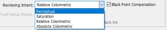
We'll be taking a look at the difference between the various rendering intents available to you in Photoshop, CorelDRAW, and all the other programmes you might use for your sublimation printing. In our instructions, as mentioned, we tend to ignore this as an option and simply tell customers to select one and not change it.
This is all very well and good for 95% of customers, as it makes no difference in the majority of use cases, but sometimes a customer will have a specific image which doesn't print properly, even though all their other designs are printed without any problems. The problem in many cases is that the image cannot be printed completely accurately by the printer. And this is where your rendering intent comes into play. Depending on which you choose, the image will print differently.
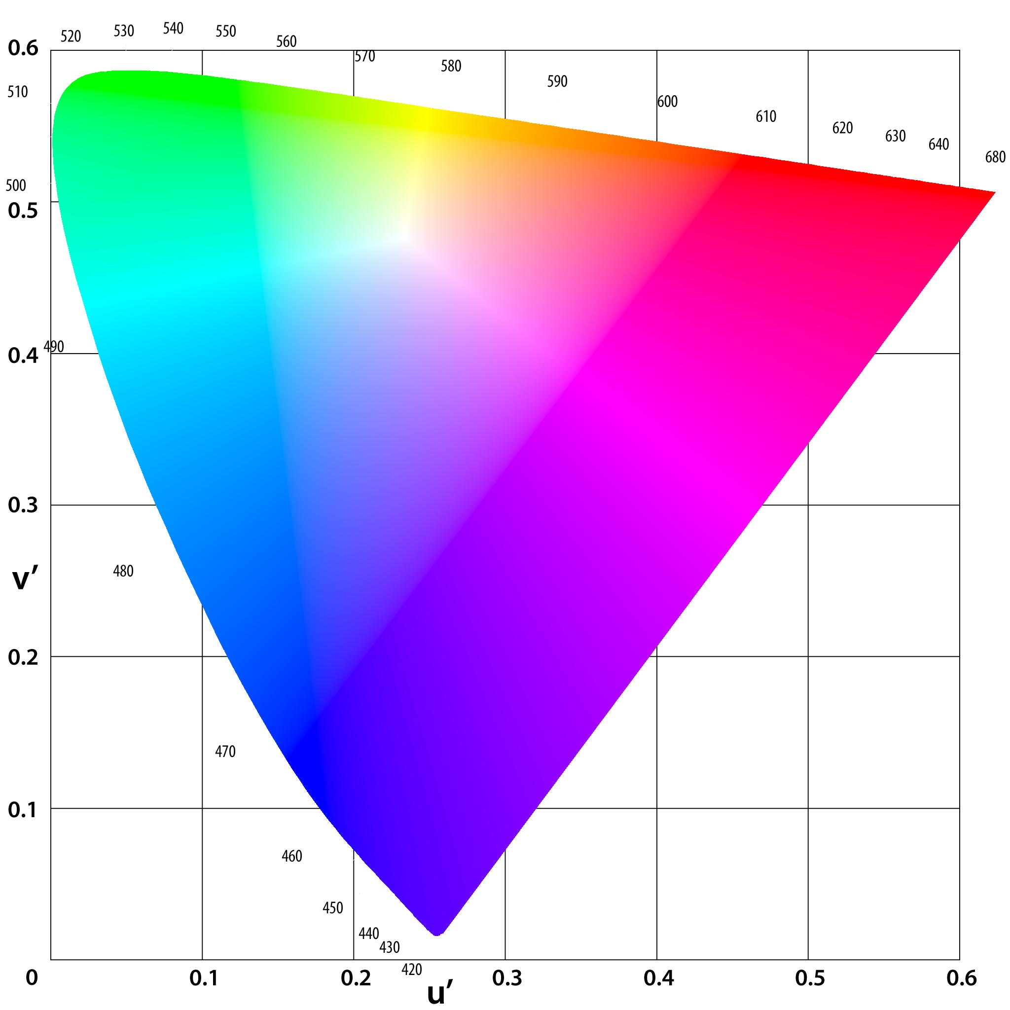
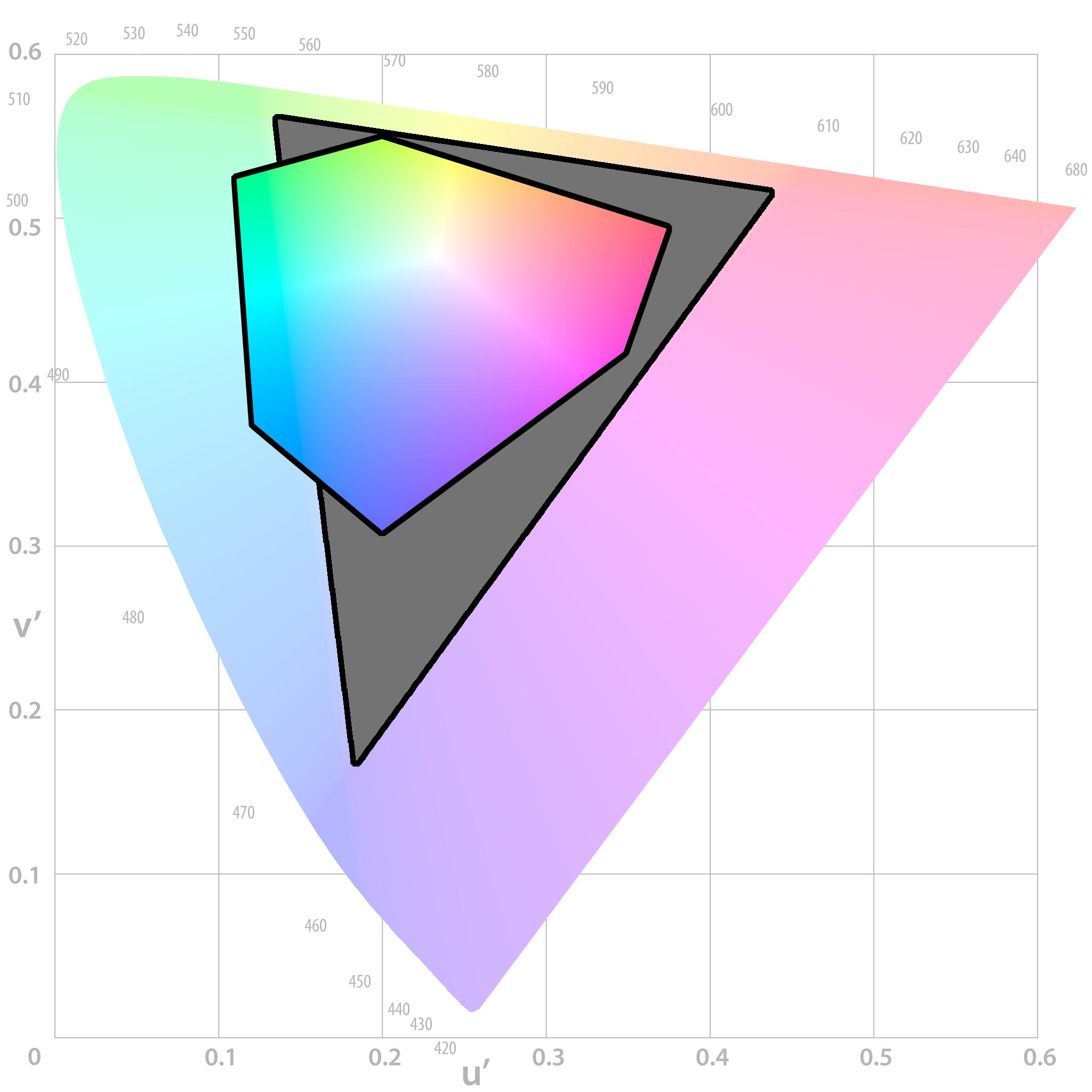
Before we get into the differences, though, a bit of background might be necessary. In this first picture, we have a representation of all the colours your eyes can see:
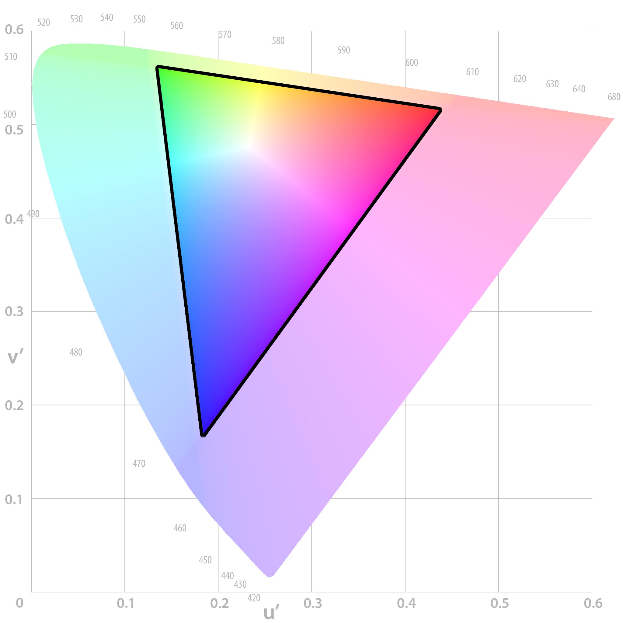
And within this triangle, all the colours which your computer screen can accurately display:
And now all the colours which a printer might be able to produce (for the purposes of this post, we've based this on a SWOP profile because it's nice and small, and will give us some extreme examples to work with):
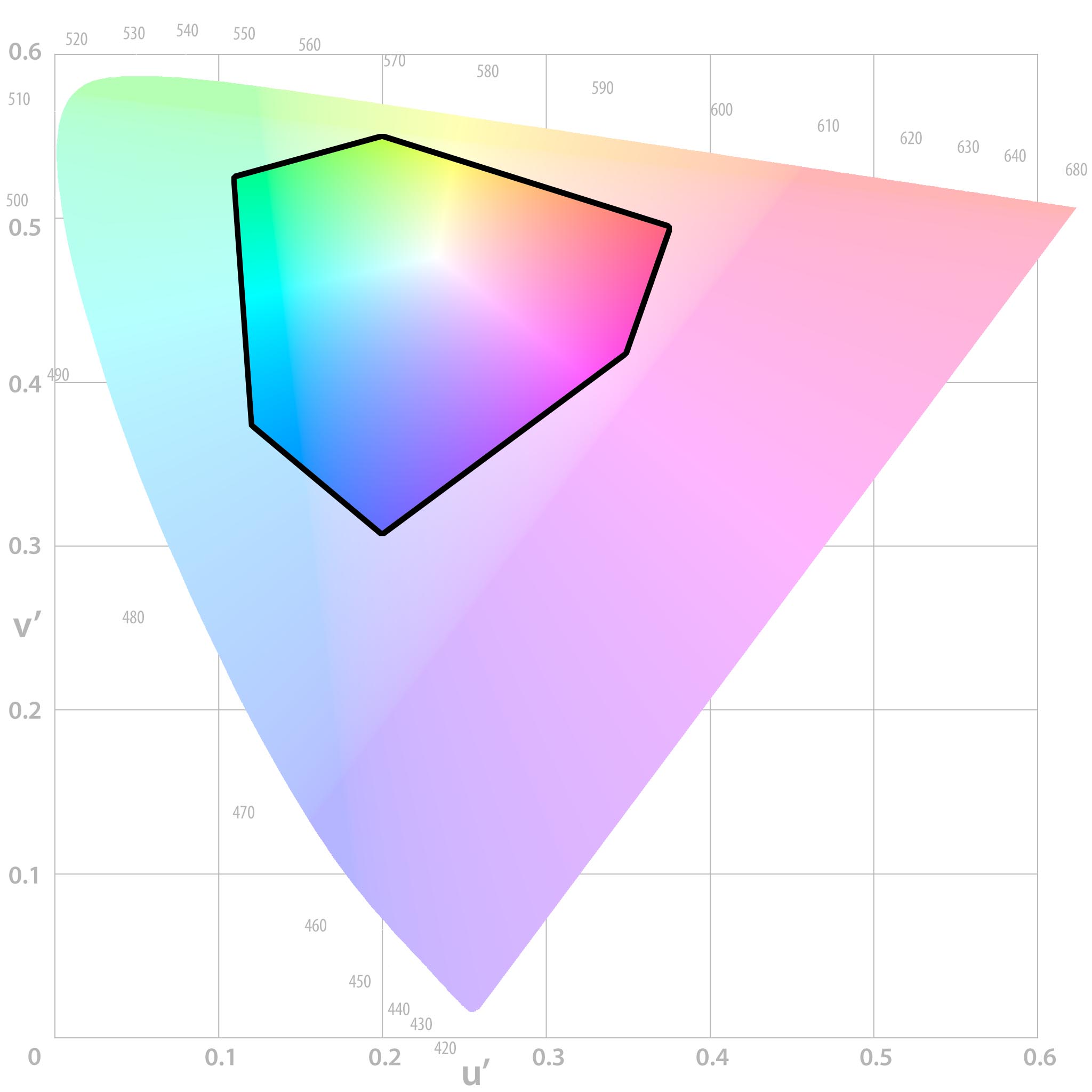
So, where the screen and printer overlap, colours can be printed accurately. Outside of this area, shown in grey below, are colours which can't be printed 100% accurately, and our ICC profile will have to compensate for this. These colours are known as "out of gamut":
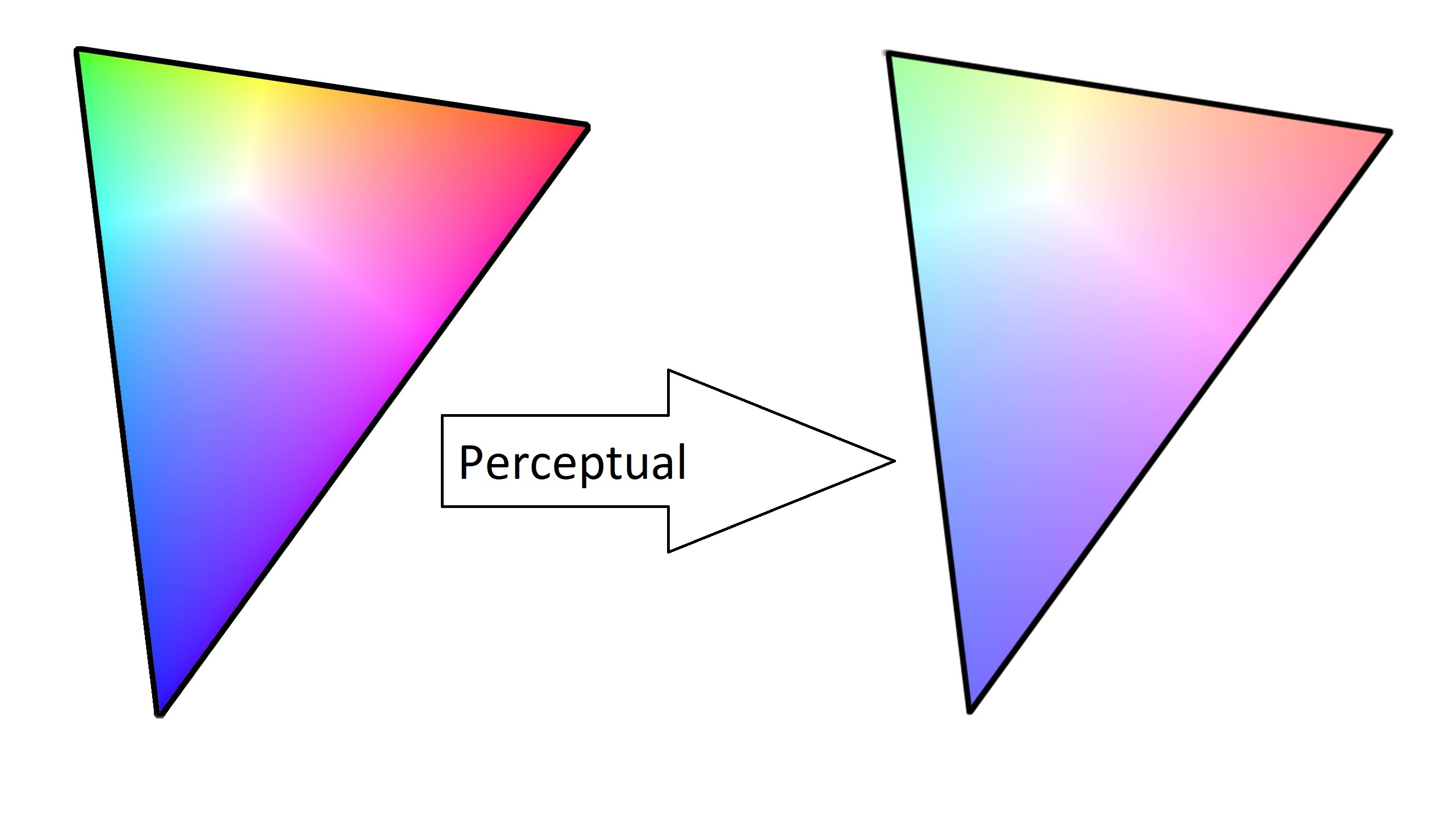
Perceptual Rendering
Perceptual rendering will squash the colours in an image until they all fall within the printable range. This means that if you have a steady gradient in your original image (such as the below), then the end result will be a steady gradient. Perceptual rendering intent is best for avoiding flat spots in a printed image, and preserving the overall "feel" of the design, whilst sacrificing accuracy somewhat.
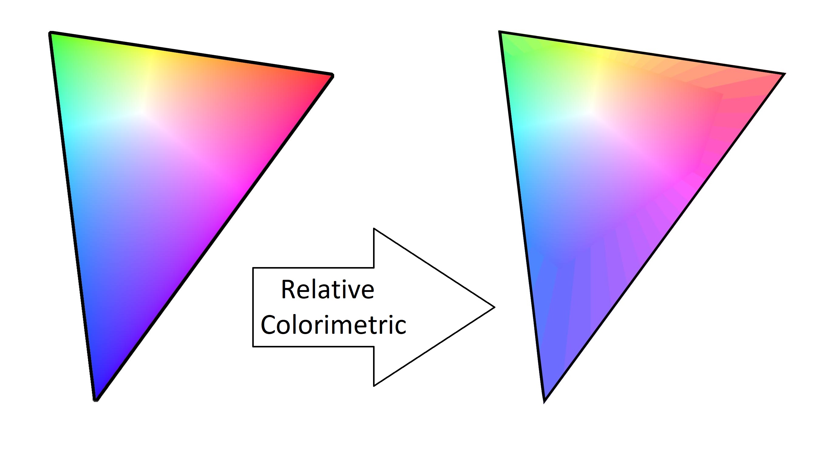
Relative Colorimetric Rendering
Relative colorimetric rendering tries its very best to preserve the original colours in an image, but for any unprintable colours the computer will just give up and pick the closest colour it can find. This will give the best results for things like skin tones, which needed to be matched exactly, but can leave you with flat spots in out-of-gamut (unprintable) areas.
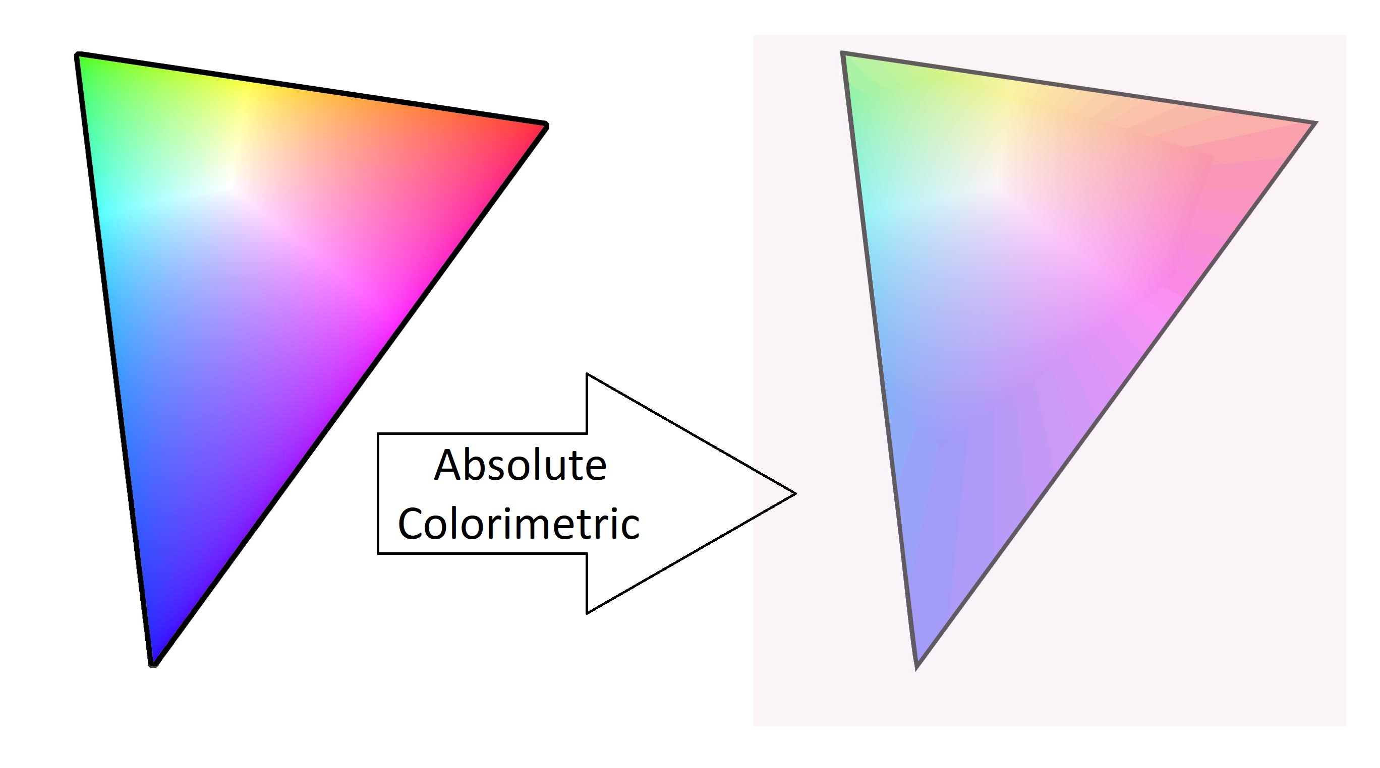
Absolute Colorimetric Rendering
For sublimation printing, absolute colorimetric rendering is absolutely awful. This rendering intent is usually used for "hard proofing" images, or printing them from one printer to try and see how they'd look on a different printer. This is only really useful if you're contracting out the printing of your images to another company, who happen to have a very large printer which has a smaller gamut than your printer, and who also aren't willing to do a test run to show you how the products will turn out.
So, absolute colorimetric asks your printer to do its best impression of a different printer, using different paper. This produces such lovely effects as your printer trying to colour in all of your paper to make it look like another paper, which is supremely useless for sublimation printing (you'd end up with a big coloured square on your finished products).
Saturation Rendering
Similarly, do not use saturation rendering for your sublimation images, you'll end up with some terrible results. In the spirit of this post, though, we'll go ahead and explain it anyway. Saturation, as the name might imply, will try to preserve the saturation (or "boldness") of colours. This works well for things like graphs and charts, where you don't care so much about the actual colours displayed, as long as they're nice and bright.
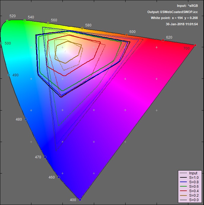
This is quite difficult to show visually. The best I could do is shown below - saturation rendering will take a colour from the screen (dotted lines) and change it to the nearest colour with the same saturation (same coloured line) in the printer profile (solid lines). If it doesn't make sense, don't worry, as you shouldn't be using this mode anyway.
So in summary, you can use either perceptual, or relative colorimetric, rendering intent. Either will be fine for the majority of cases, but if you're trying to print colours which your printer can't accurately reproduce, maybe try the other one as well.