Sublimation ICC profiles are created by scanning the media after sublimation for more accurate colours
Why would you create and ICC profile from an item sublimated on ceramics then use that profile when pressing on a different media type ?
A wider range of tones and closer match to the original colours is achieved by using an ICC profile created around the media type you are pressing - custom icc profiles are better if you are trying to colour match a specific design.
ask yourself these questions
1: If you have an icc profile what was it created from ?
2: Are you using it on the same or similar media type ?
3: Are you getting the best results you can from your current setup and supplies ?
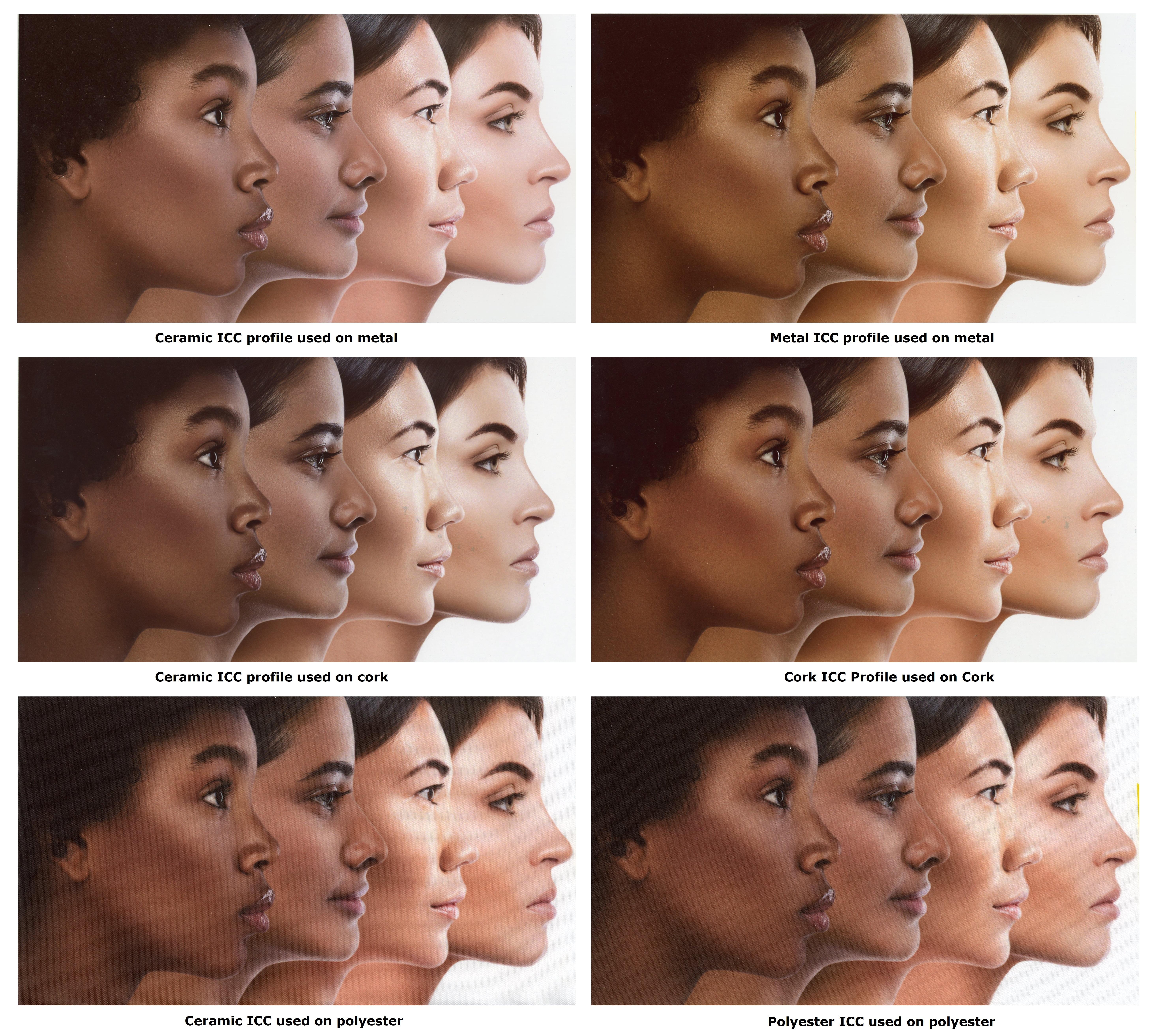
Here are some examples of some images that have been sublimated onto products and then scanned into an image file
The source ICC profile was made on ceramic then we used this profile on other media types and then compared to an icc profile made around the specific media type.
The images do show what we expected - but please bear in mind these are sublimated scanned images - looks much better sitting here looking at the physical products.
TEST 1
For our colour test charts on this one we are using a using an icc profile created from ceramic media on an aluminium sheet
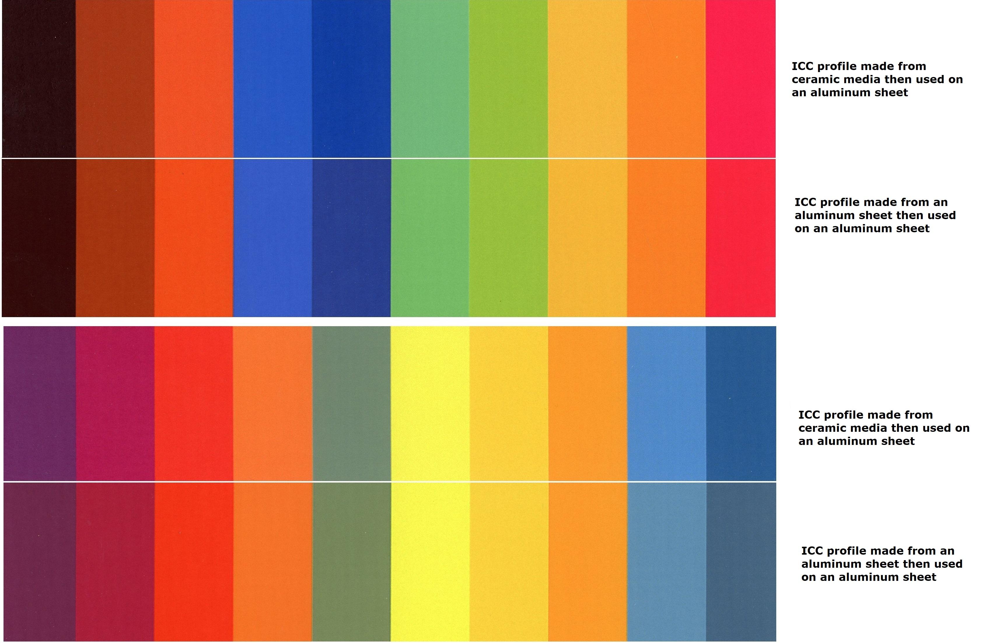
On this one we are using a using a ceramic icc on a metal item and the most noticeable differences on this image are in the deeper blacks / shades with subtle differences in the colours some more than others overall blues and blacks appear to be the most affected colours when not utilising an icc made on the media type.
TEST 2
For our colour test charts on this one we are using a using an icc profile created from ceramic media on a Polyester sheet
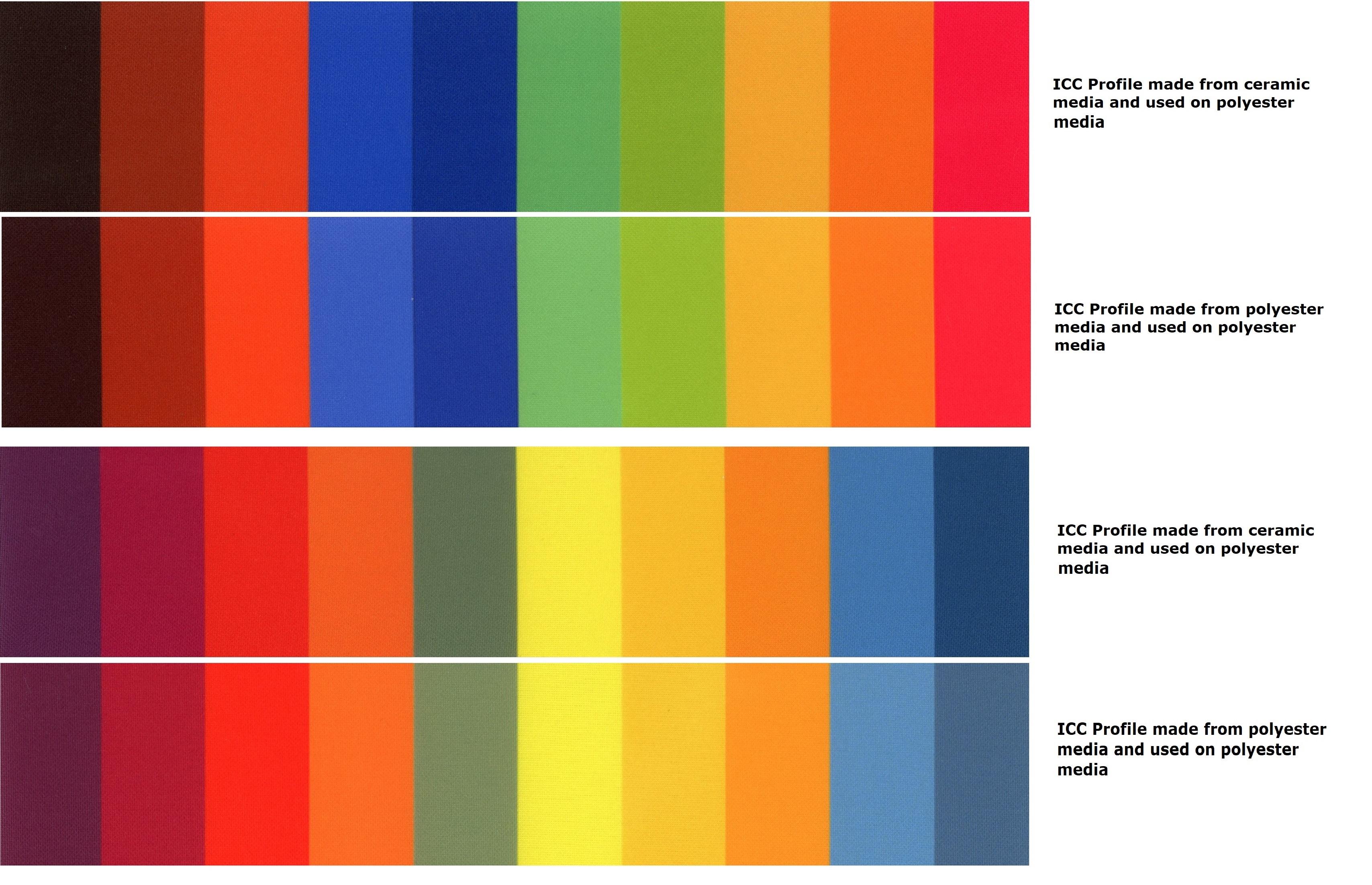
On this one we are using a using a ceramic icc on a polyester item and the most noticeable differences on this image are in the blacks / shades ( in person the polyester one is more true ) with subtle differences in the colours some more than others overall blues and blacks appear to be the most affected colours when not utilising an icc made on the media type.
TEST 3
For our colour test charts on this one we are using a using an icc profile created from ceramic media on a cork / mdf item
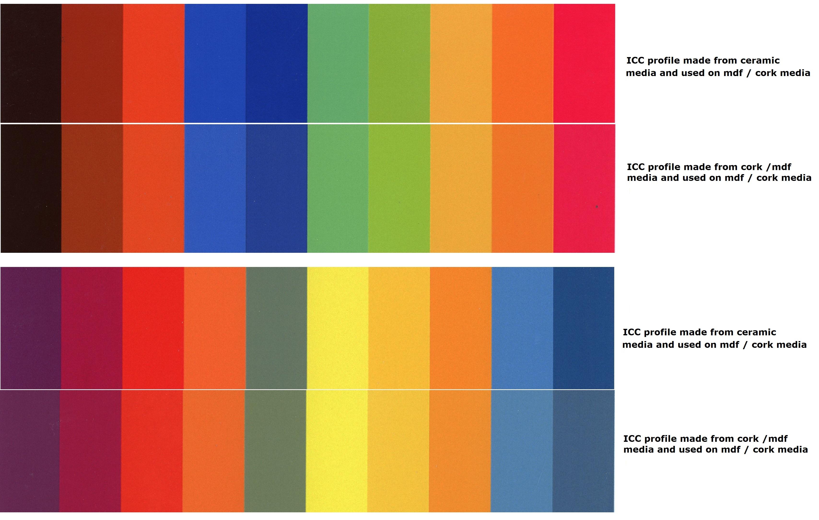
On this one we are using a using a ceramic icc on a cork /mdf item and the most noticeable differences on this image are in the blue shades
All tests showed darker blues and black when utilising a profile from a different media type but that's not what we are trying to achieve - we are trying to colour match - if we wanted darker blues and blacks we could of just changed our original image